OBDII, where it all comes together ...

Mitsubishi Outlander PHEV Forum

Help Support Mitsubishi Outlander PHEV Forum:

This site may earn a commission from merchant affiliate links, including eBay, Amazon, and others.

anko

Well-known member
Joined
Dec 1, 2014
Messages
3,405
Location
Netherlands, Utrecht area
Hi there,

Yesterday, I have done a very extensive "test drive". Dragged my caravan into the Dutch hills in Limburg (approx. 180 km to get there), drove around for an hour or three with two professionals that are specialised into modelling expected performance of tow cars. They were very interested to test drive my car, as their theoretical models do not support a car like ours. After that, I dragged the caravan back home again. Total distance covered was over 400 km. How is that for saving fuel :mrgreen: BTW: Total fuel consumption, including all testing, was 13 l / 100 km. Totally happy with that.

We did lots of normal driving but also a series of hill starts (although slopes are short in the Dutch hills, gradients up to 17% can be found in that region).

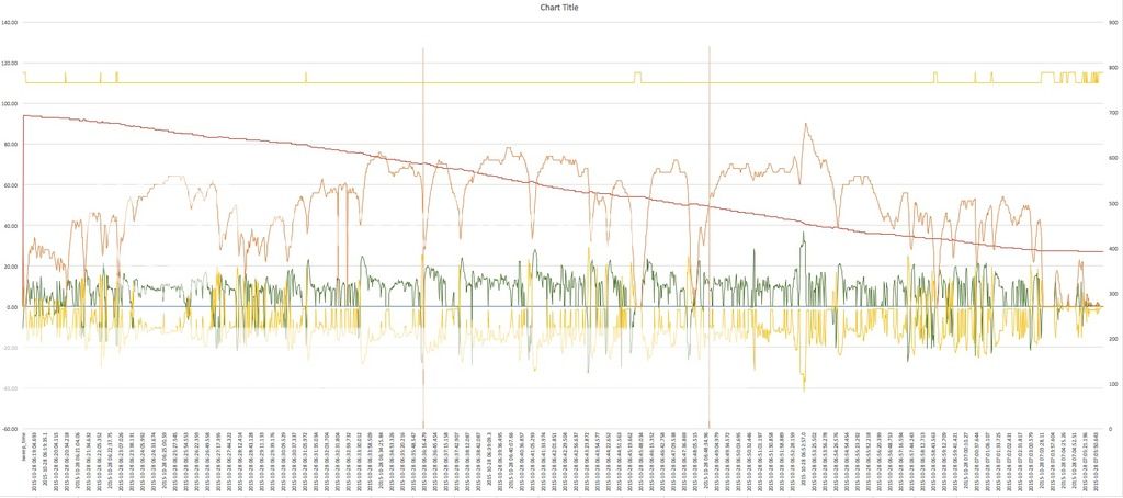
All the time I had Torque Pro running, using my protocol converter. I have been logging lots of data into CSV files and captured this into a consolidated XLS in which I did some post processing: https://www.dropbox.com/s/x04sypacg3by4ww/Towtrip no formulas.xlsx?dl=0 (sorry, it is rather big). Most of the stuff is self explanatory.

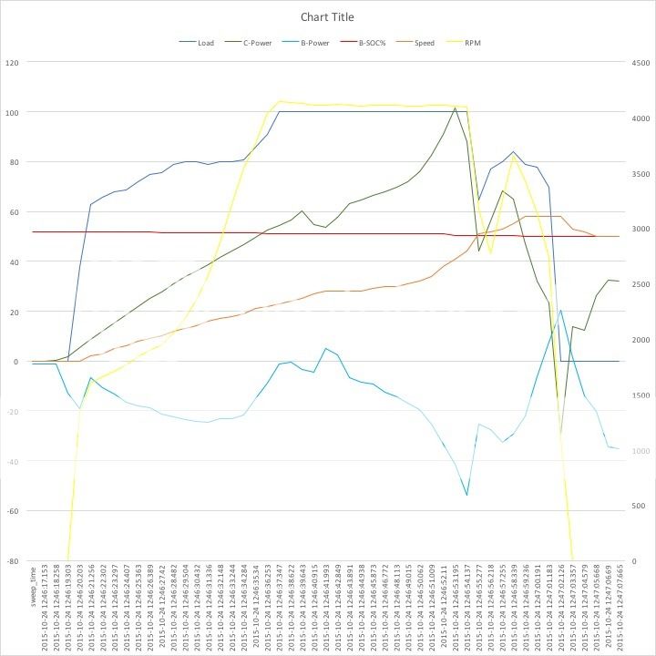
Column H is how much of torque available at given RPM is actually produced.

You must realise one cannot read out all parameters from all different ECU's at the exact same time. This difference is reflected in columns A and B of the XLS: A is the time at which a sweep of all requests was started, B is when the response for a particular request was actually received. This means that, for instance, received values for front and rear motor are a little bit shifted (as little as 150 msec).

Although this time difference is very small (a full sweep is generally perfromed in approx. 1 second), you might find that within a single sweep, one motor shows to be propelling the car, while the other shows to be slowing down the car. Where this happens, column V (which shows how much of the total electric power is coming from the rear motor), will show +/-, to flag that calculating power distribution is meaningless at that moment. When there is no power delivered at all by both E-motors, column V shows NOP (no power).

One interesting thing my data shows is that even with a depleted battery, you still have a lot of grunt left. When I got off the motorway, SOC was down to approx. 25%. I had 7 km of 50 MPH road to cover. At the first traffic light, I got into that fast lane ( :oops: ) to get ahead of other slower traffic. On the next 7 km of 50 MPH road, I did several 40 - 60 MPH sprints, totally wrecking my SOC. At row 1862310, you can see that even at 23% SOC, I still get >108 kW from the E-motors.

Questions? Shoot!

Next step is to build some nice graphs based on this data. TBC.
 
I converted the .xlsx file format to .csv and am writing a VB6 app for rapid access viewing of graphs of the data. I will make the app suitable for viewing my own logged data from Torque PRO, once I have settled on what I want to log. Will post some pics once I have it all sorted.

The testing started at about 8:00AM and concluded at just after 6:00PM ??, giving about 200000 records ??
 
I have crunched some of the data and here is some graphed.

PHEVobd_anko.gif


I have plotted petrol tank level[in red], and %SOC [in white], and Coolant temperature [in aqua] for the full data set as supplied from "anko". The number of data points was well beyond my version of Excel, so I have written a decoding and graphing package in VB6, that I can define the number of records graphed. I can zoom in on any section for a good look if needed. I have only plotted the least eratic data. There is a lot of noise in the fuel tank level, as the tide goes out. To get this in perspective, the data is readings avery 150mS for 10 hours. [about 200000 records], not ~ 1860000 as reported above.

I think that there will need to be some data filtering and that averaging and logging every second would be more useful.
 
I've taken the data and stripped out the Fuel Level, Speed and SOC columns into a new sheet.

I've then summed these values to do a compare and stripped out duplicate values, dropping it to 10.5k rows instead of 198k rows.

I then added trend lines against all 3 as this smoothed the lines out and then hid the actual data (changed the lines to white) so the trend lines showed better.

Hope you find it useful.

081858.jpg


http://www.dropshots.com/Ozukus/date/2015-10-26/08:18:58

So Dropbox didn't work, so transferred to dropshots.
 
Let me explain why there is so much (duplicate) data.

Every row represents in essence a response to a single request. A There are about 10 request / responses per sweep. I could have only populate the columns associated with that particular response, but then I would not be able to add power delivered by front motor and power delivered by rear motor to obtain total E-power. Or correlate fuel consumption to SOC.

Therefor, I copied all PID values down upto the row in which a new value for that PID was received.

In theory, it would be fine to just keep the last row of each sweep. Or the last row of each sweep. But then you lose the information about time shifts between various PID values.

Some graphs would not need it, some others would, was my line of thinking. But wasn’t sure about that yet. This is why I, for the time being, uploaded the raw data.

BTW: Fuel Level and Coolant Temperature are measured only once every so many seconds, to reduce average sweep time. TP will request them in every sweep, but my in-between program will feed TP with cached data that is only refreshed once every now and then.

BTW2: I did not have instantaneous fuel consumption in this graph. I have added it to my dashboard this morning, approximated as MAF * 33.55 / SPEED
 
Ozukus said:
I've taken the data and stripped out the Fuel Level, Speed and SOC columns into a new sheet.

I've then summed these values to do a compare and stripped out duplicate values, dropping it to 10.5k rows instead of 198k rows.

I then added trend lines against all 3 as this smoothed the lines out and then hid the actual data (changed the lines to white) so the trend lines showed better.

Hope you find it useful.

7TKlS4I5OaKWWkAkwMi5AzGCs-8F2Y75D5l0qtoBoao
Unfortunately, the image is not showing. Did you share your dropbox older to the public?
 
anko said:
Unfortunately, the image is not showing. Did you share your dropbox older to the public?

Don't have dropbox pro so can only share via there with named users, so transferred to dropshots on my original post, and included the link as well.
 
I will be travelling to Melbourne at the end of the week, and then on to Sydney before returning home again. Will be a few thousand more km to record some data. Will be recording sat data as well as petrol consumption and speed, as well as power to the wheels. Should be able to test at some pre defined %SOC levels with SAVE and CHARGE and NORMAL modes of operation to once and for all objectively identify any particular mode of operation to get best ICE only economy.

Maybe just a post of the graph from a screen shot.

I use http://postimage.org/
 
Ozukus said:
anko said:
Unfortunately, the image is not showing. Did you share your dropbox older to the public?

Don't have dropbox pro so can only share via there with named users, so transferred to dropshots on my original post, and included the link as well.
Indeed. Nice! 10 million dollar question: can anybody figure out how late I stopped for gas? :lol:
 
anko said:
Ozukus said:
anko said:
Unfortunately, the image is not showing. Did you share your dropbox older to the public?

Don't have dropbox pro so can only share via there with named users, so transferred to dropshots on my original post, and included the link as well.
Indeed. Nice! 10 million dollar question: can anybody figure out how late I stopped for gas? :lol:

You stopped about 11 minutes to 4PM, and it took you about 3.5 minutes to fill the car!
 
The car was powered OFF at "2015-10-24 15:49:16.282"
The car was powered back ON at "2015-10-24 15:52:32.473" Local time of course.

Interestingly I noticed that the Fuel capacity went to zero from 12% and then back up to 11% just before you filled up.

The RAW OBD data shows so much noise on the fuel tank sensor that I would not be using it for any serious analysis. This may also be a problem for other dynamic sensor data. We will need to be careful and possibly include some error analysis of data for any objective comparisons.
 
gwatpe said:
The car was powered OFF at "2015-10-24 15:49:16.282"
The car was powered back ON at "2015-10-24 15:52:32.473" Local time of course.

Interestingly I noticed that the Fuel capacity went to zero from 12% and then back up to 11% just before you filled up.

The RAW OBD data shows so much noise on the fuel tank sensor that I would not be using it for any serious analysis. This may also be a problem for other dynamic sensor data. We will need to be careful and possibly include some error analysis of data for any objective comparisons.

Sounds like the fuel tank level sensor is towards the rear of the tank then?
 
Yes, the fuel level indicator responds rather quickly to movements of the car. The gauge on the dashboard must be showing an average value over a sliding window, or something like that. But the gauge on the dashboard is not very informative. Ver y optimistic in the beginning, very pessimistic towards the end. Therefor, I wanted to have direct access to the sensor reading and put it on my dashboard. Of course, you must be careful interpreting it. Best when the car is stationary for a while.

I never added it with the intention of estimating fuel consumption or such. For this I have now added the Instantaneous Fuel Consumption parameter, which is calculated from the reading from the Mass Air Flow sensor and Speed. Although it is an approximation, it seems rather reliable.
 
trip%20to%20the%20office_zpsn5wm7itu.jpg


Pure EV trip of 40.5 km into the office, this morning. The two vertical lines at roughly 1/3 and 2/3 suggest the engine was started twice very, very shortly. Must have been some sort of glitches, because the engine will not run for less than 1 second.

Red line is SOC, dropping from 94% (after pre heating) to 27%..
Green line is power from the E-motors (kW).
Yellow line at bottom is discharging of battery (kW).
Orange line is speed (km/h).
Yellow line at the top is braking (not hitting the pedal, but hitting the brakes themselves):
- during startup
- 4 speed bumps
- 1 traffic light half way
- couple of traffic lights near the office
- parking lot at the office
 
The Outlander pulling out with approx. 1300+ kg of caravan plus 4 male adults.

hillstart_zpssbqcyx06.jpg


Started with engine warm but off (Normal mode).

C-Power is combined output E-motors (kW)
B-Power is charge / discharge of battery (kW)
Load is engine load in pct
RPM (yellow line) uses scale on right hand side of the graph

It took about 22 seconds to reach 28 km/h. Sound bad? Well, it was at the very first bit of this piece of road:

Gulperberg-west.png
 
anko said:
Interesting to see how, somewhere in the middle, the E-motors put out 53 kW and the engine is recharging the battery !! Just a little bit, but still ....

Do you know why this happened?

Did the road level off a little? But the speed leveled off yes. :? Lift foot off accelerator? Load stayed the same. C power dropped. Petrol motor still revving out.

I am confused. :lol:

I just love the graphs that are starting to show up. :D

Regards Trex.
 
Trex said:
I am confused. :lol:

I just love the graphs that are starting to show up. :D

The toils of a few will hopefully benefit the many.

I am finding that logging is creating a lot of data and until I finish my data historian program that will allow me to rapidly examine the data, the graphs may be a little daunting to look at.

The pics posted on the forum will need to be carefully selected as I am finding graph colours and font sizes and too many lines are confusing. I hope to, in the first instance, replicate some of the data published by MMC and posted on the forum in pics.

In particular the operation of the ICE in SAVE, CHARGE and NORMAL modes at varying levels of battery charge and any effects on petrol economy.

So far, my recording has not shown the ICE turn ON&OFF like in the MMC pics. May need longer periods of constant speed and loads.

At last with logging, I am able to get data on any drive, and have reduced test specific drives to get data.
 
Back
Top